from d00phy@lemmy.world to apple_enthusiast@lemmy.world on 21 Sep 23:26
https://lemmy.world/post/36273124
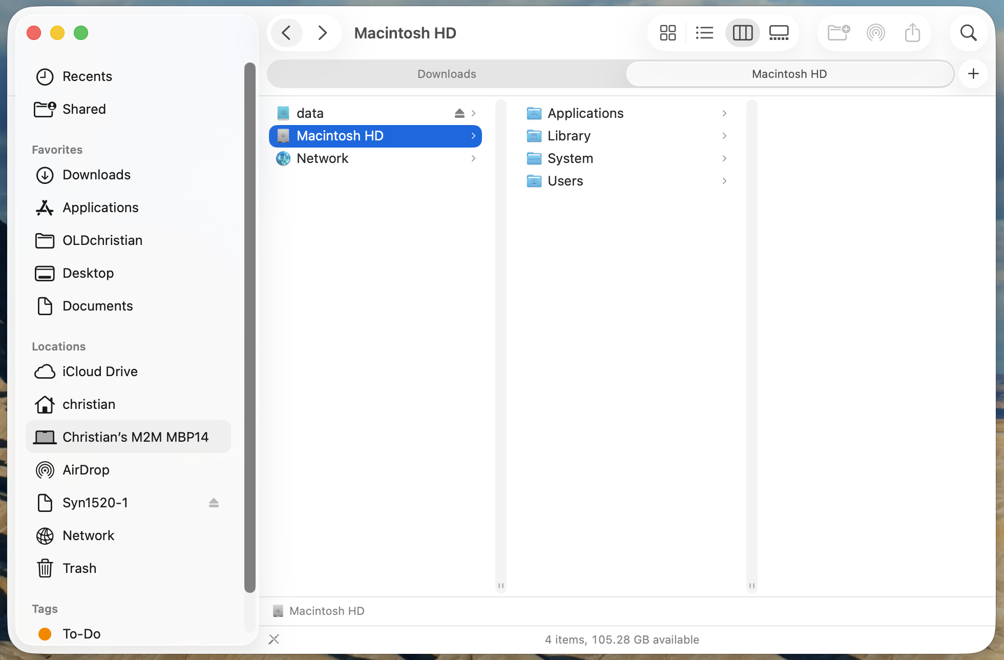
It’s just… ugly. It’s kind of a retro-ish, but chunky design. It really shows it full ugliness in the Finder windows, especially when you column view (which I default to). It looks like a design by committee mishmash of stuff that all collides. I’m not normally one to hate on stylistic choices in an OS. I’ve never had much interest in “ricing” my environment, but I’m really just not a fan of this.
All the individual little “bubbles” of things instead of buttons, or even just borderless areas denoted by an icon. The way the left column looks like it’s just plopped down on top of the rest of the content. Like it’s a separate entity, but it’s not. Especially noticeable in how the lower cookie crumb trail at the bottom of the window just abruptly ends at the border to the left column. Also, the color choice for the sliders is… bold. Almost the most noticeable thing in the screenshot! This looks like a Linux Enlighenment DE theme from the early `00s trying to emulate OS-X. The dark view looks slightly better.
About the only positive thing I can find is the tolerances around the edges of windows for resizing feels more forgiving than in the past & w/ other operating systems (ahem: Windows). On some OSs/desktop environments, it seems like there’s a 1-2 pixel area where the cursor changes and you can resize a window. In contrast, this works pretty good in Tahoe.

threaded - newest
Personally, I like the eye candy. However, beauty is in the eye of the beholder. We should get an option to opt out. Or, better yet, allow us to reskin on our own with our own themes.
This is not an unpopular option. Every other post is about this being ugly or buggy.
I’ve grown to like the iOS version of this update over the past month, or at least i don’t find it as abrasive anymore, however they have clearly just not spent enough time designing Tahoe. It’s buggy, it’s laggy, it’s unfinished, and there are elements that have just not been updated at all
Looks a lot like GNOME (i.e. ugly)
Worse, it looks like Pop_OS!
Yea. It’s like they are getting ready to make macOS a touch interface.
It feels, to me, like they are doing a very slow merger of the iOS and macOS systems, eventually I believe they want it to be just one that scales to the device.
<img alt="" src="https://lemmy.world/pictrs/image/697c3eb2-53b5-4684-948d-fb263651e926.webp">
We’re only a bit behind xkcd.com/1508/
<img alt="" src="https://lemmy.world/pictrs/image/34e35902-44a4-4931-9522-d85ae0a923de.png">
Forgot the Linux home server that was turned on and forgotten about but has been running continuously for decades of uptime and continues running off solar power even after civilization has ended.
It’s unfinished. Like iOS 26. Unacceptable little bugs everywhere.
Not a Mac user, so I’m seeing this for the first time. At first I didn’t get what you meant, but the longer I looked the more things I found that bothered me.
Here’s a list (feel free to add things):
This is just visuals. I can’t judge the functional aspects of the design.
One is a path bar, the other is a status bar. The path bar shows you the full filesystem path to where you are, the status bar shows you details like object count and size. They’re independent things that can be separately enabled / disabled through the view menu.
Also, that’s not a close button. It’s a pencil with a slash through it, the user does not have write permission for that location.
Oh it gets worse, the radius is also inconsistent across different kinds of windows and applications
The rounded corners all all inconsistent sizes. Worst of all, for the really large rounded corners like in the settings app it clips off the scroll bar.
I hate the round buttons in Chrome - seeing them everywhere now just makes me want to switch to another OS. Round buttons just looks so uninspiring and cheap.
I thought this picture was a render, a joke
Snow Leopard is where ui peaked
<img alt="" src="https://feddit.nl/pictrs/image/f212e761-d03f-4732-9bc1-5247ebb46ebf.jpeg">
We need to roll back all OS UI designs to 2010 until we can figure out what the hell is going on. Bring back windows 7.
literally
Theres a theory that Apple released this a year early and unfinished because Apple Intelligence is so far over its head that they had nothing else to debut