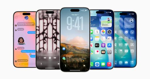
Apple introduced iOS 26.
(www.apple.com)
from Pro@programming.dev to apple_enthusiast@lemmy.world on 09 Jun 2025 19:51
https://programming.dev/post/31917882
from Pro@programming.dev to apple_enthusiast@lemmy.world on 09 Jun 2025 19:51
https://programming.dev/post/31917882

threaded - newest
I’m curious to see how some of this stuff feels in real life. The aggressive use of transparency was something Apple and Microsoft intentionally moved away from many years ago. It creates clutter and readability problems.
I’ll bet money that they dial some of this stuff back after getting beta feedback.
The 9:41 clock display they keep showing on the lock screen seems like it’s less readable than just a solid colour, but yeah, would need to use an iPhone with this before I can make any judgement.
Another user shared this screenshot in the other post about the new design language, and it definitely has readability problems when there’s too much on the display at once.
<img alt="" src="https://lemmy.world/pictrs/image/3899357f-c6d8-4f43-9d9e-96651d14f177.png">
I only have a work iPhone but man, control center has always looked bad to me. Then they just dialed it up to 11 with the transparency and colors.
Usability looks absolutely awful with this update.
I‘ma get the beta and test it.
Edit: voyager started working again. Battery drain is massive, visibility is bad.
This looks like those gimmicky android launchers and themes from a decade ago
But now with ✨️REFRACTION✨️ ‼️
Looking forward to iOS Vista!
So they’ve realised everyone fucking hated it when they merged them in iOS18 and have decided to seperate them again?
Better to realize a mistake and fix it then to stick with it.
Other than the design, I really do love the new features of iPadOS after using it for a few hours (windows, even the title bar like on macOS, the much improved finder, default apps for specific file types, preview app). Seems to me like a leap in the right direction.