heygooberman@lemmy.today
on 02 Dec 2023 18:40
nextcollapse
The Bottom Right
Moobythegoldensock@lemm.ee
on 04 Dec 2023 19:22
collapse
Absolutely, that one’s amazing.
Juujian@lemmy.world
on 02 Dec 2023 19:03
nextcollapse
5, 3, 6 are all decent.
node815@lemmy.world
on 02 Dec 2023 19:15
nextcollapse
1 or 2.
I don’t care so much for pixel art or the greenish ‘honeycomb’ one. The bottom left would be third choice.
bruhduh@lemmy.world
on 02 Dec 2023 19:26
nextcollapse
Backpack one
nossaquesapao@lemmy.eco.br
on 02 Dec 2023 19:54
nextcollapse
The one with the tree is so cute and makes me feel at peace.
ace@lemmy.ananace.dev
on 02 Dec 2023 19:55
nextcollapse
Definitely the third / middle left, but the bottom right definitely gets second place to me.
Not a major fan of too abstract art, and those are just both so serene.
neige@lemmy.world
on 02 Dec 2023 19:57
nextcollapse
Noctechnical@lemmy.ml
on 02 Dec 2023 23:36
nextcollapse
What’s stopping me from just saving the images and then using my preferred one on my own setup?
retrieval4558@mander.xyz
on 03 Dec 2023 01:43
collapse
Nothing
BaumGeist@lemmy.ml
on 02 Dec 2023 23:42
nextcollapse
If I’m going to have a lot of icons on the desktop, I’d want one of the visually uncomplicated ones (top right, bottom left). Otherwise, if it’s just for eye-candy and what I have to see everytime my windows are minimized, I’d either go for mid-left or bottom-right. I fall into the latter category, but y’all in the former may consider that when casting your vote
This. It needs to be visually uncomplicated so I can actually see what’s living on the desktop. Because of that, I prefer bottom right the most, though I generally like much darker backgrounds. Color shift that into something darker like an alien or night scene, and it’d be perfect for me.
punkwalrus@lemmy.world
on 03 Dec 2023 01:01
nextcollapse
I am not wild about any of them, but center left, bottom left are my least annoying. I’ll just change it to something else when i go to Plasma 6 (which I started testing, and while overall it looks great, and is pretty snappy, the Neon Testing is seriously unstable in other areas – but they warn you about that, so that’s on me).
Joelk111@lemmy.world
on 03 Dec 2023 02:02
nextcollapse
I like middle left and bottom right. Top left would be alright too - kinda generic, but I like it better than any windows default background.
onlinepersona@programming.dev
on 03 Dec 2023 19:48
collapse
The hexagons do look nice. I wouldn’t mind having all of them though. They could rotate at every boot.
WalrusByte@lemmy.world
on 03 Dec 2023 03:08
nextcollapse
Middle right and bottom right are my favorites
01189998819991197253@infosec.pub
on 03 Dec 2023 03:13
nextcollapse
In order, starting with most favorite: bottom right, middle right, middle left, top left.
Not a fan of the top right and bottom left.
ProgrammingSocks@pawb.social
on 03 Dec 2023 03:59
nextcollapse
Default? Top left. It should be visually appealing to most people, and it would honestly just be odd to have the default wallpaper be cartoon styled. And the bottom left looks too much like W11. But I think they should all be included as options.
13617@lemmy.world
on 03 Dec 2023 04:14
nextcollapse
LEGO wallpaper for fortnite collab
mdk_@lemmy.world
on 03 Dec 2023 05:40
nextcollapse
Top right seems to be the best.
The others:
Top left: Mystery tongue coming from or going somewhere
Middle left: Much to bright, hard edges make finding icons difficult
Middle right: Too many dark areas
Bottom left: Might be okay as well
Bottom right: Too bright and might not fit the mood as this seems to be an anime inspired background
Holzkohlen@feddit.de
on 03 Dec 2023 08:11
nextcollapse
Imma set bot right and never ever touch it again. I’m good as long as it’s not too bright. Don’t particularly like to flashbang myself on accident.
tetris11@lemmy.ml
on 03 Dec 2023 16:56
nextcollapse
You and me are chillin’ buddies
princessnorah@lemmy.blahaj.zone
on 05 Dec 2023 01:32
collapse
The dark mode variant of that one is truly beautiful, and shouldn’t flashbang you:
dabaldeagul@feddit.nl
on 03 Dec 2023 19:39
collapse
Godus doesn’t use hexagons, right?
archy@lemmy.world
on 03 Dec 2023 18:17
nextcollapse
3rd one fits KDE style, also 6 is amazing too
smileyhead@discuss.tchncs.de
on 03 Dec 2023 18:28
nextcollapse
3 and 4 are nice but as something someone would set themself. Too much character and detail to be the default when Plasma do not target any specific demographic.
1, 2 and 5 are nice abstract wallpapers, but honestly boring as we have stuff like that for years.
6 is the best. This is wallpaper with some style, but not too much character.
Edit: Just in my opinion and for my eye of course.
Tier1BuildABear@lemmy.world
on 03 Dec 2023 18:42
nextcollapse
The one with the clock better have a moving clock otherwise I hate it. Static clocks should never be part of a wallpaper.
callyral@pawb.social
on 03 Dec 2023 20:06
nextcollapse
The middle-right one. Would be nice though if instead of a clock it had something else since it’d be weird to have a static clock.
My secondary choice would be the one with the red tree.
danileonis@lemmy.ml
on 04 Dec 2023 10:52
nextcollapse
1
reallyzen@lemmy.ml
on 04 Dec 2023 11:22
nextcollapse
I already installed 6 (the Tree) on my… Gnome laptop. As opposite to one of the feedbacks on the competition page said about the Night version, I don’t care about legibility of my desktop items huhuhu.
SVcross@lemmy.world
on 04 Dec 2023 11:43
nextcollapse
Just the picture is ok.
Gobbel2000@feddit.de
on 04 Dec 2023 12:35
nextcollapse
The hexagon minecraft one is neat.
embed_me@programming.dev
on 04 Dec 2023 13:01
nextcollapse
Gave me catan vibes
voidnutcracker@feddit.de
on 04 Dec 2023 18:40
collapse
threaded - newest
1
3
Middle left. Don’t know the numbering scheme, 3?
Yes, 1,2 and 5 look too much like a windows background. I think this one is unique and still clean and calm.
HEXAGON
THE BESTAGON
The Bottom Right
Absolutely, that one’s amazing.
5, 3, 6 are all decent.
1 or 2.
I don’t care so much for pixel art or the greenish ‘honeycomb’ one. The bottom left would be third choice.
Backpack one
The one with the tree is so cute and makes me feel at peace.
Definitely the third / middle left, but the bottom right definitely gets second place to me.
Not a major fan of too abstract art, and those are just both so serene.
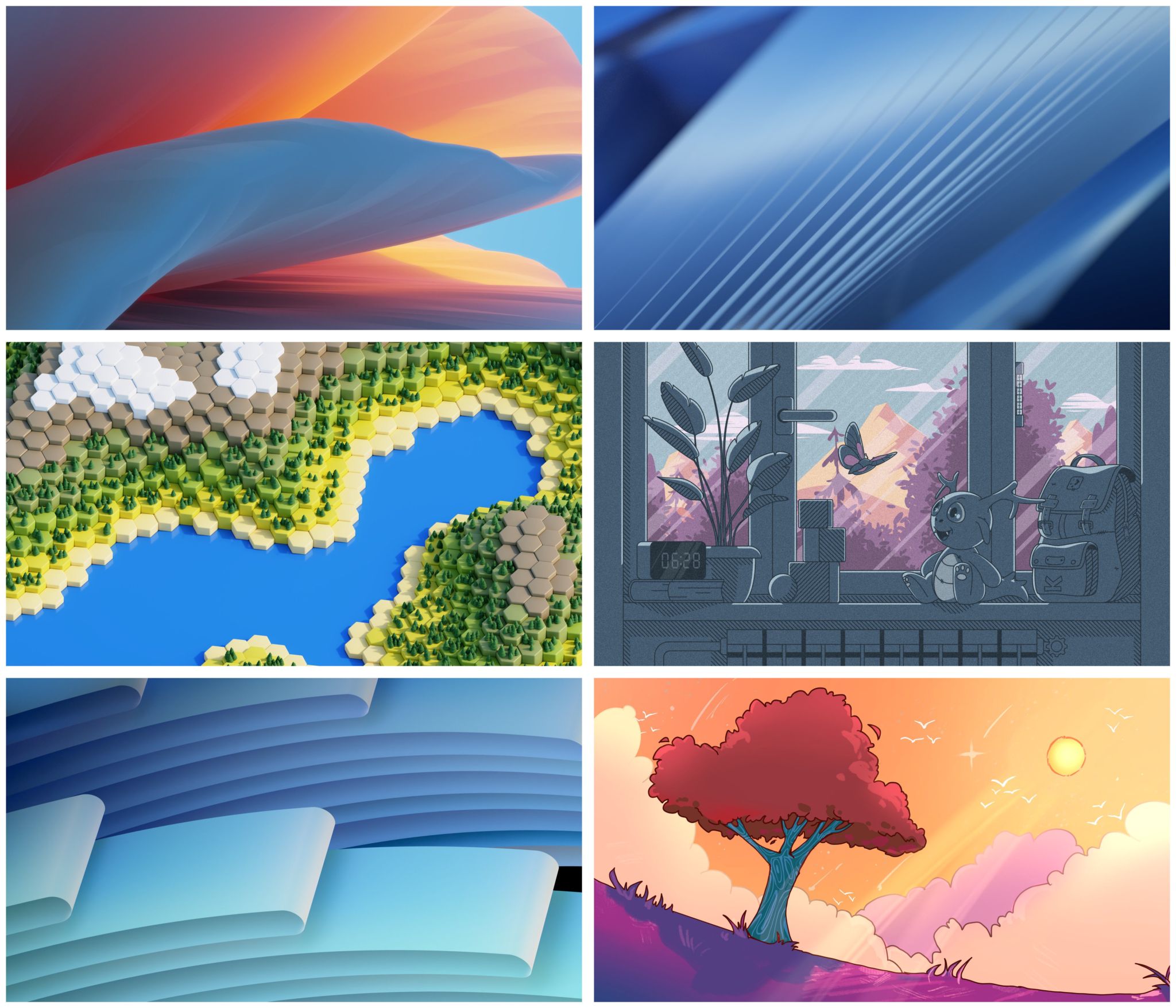
Wallpapers and their dark and mobile variants can be found here. discuss.kde.org/t/finalists-announcement/7862
I simply love all of them!
If looking from top left to right my favourites are 3,4 and 6.
1,5 and 6
If I’d have to choose I’d go with Window or Tree, I’m not fully convinced of either tho… I like Konqi in the Window one.
The tree one… Hands down
I like the vibe of 4 and 6.
Then 5, 2, 1, 3, that have ‘professional’(?) look.
FLOW, STAIRWAY & WAVES are just literally every wallpaper ever. Uninspired.
Give us some inspirational suggestions then, oh holy one
SUN / COMET, HEXWORLD & HARMONY.
Anything that’s not just following the exact same design language like FLOW, STAIRWAY & WAVES clearly are doing.
.
What’s stopping me from just saving the images and then using my preferred one on my own setup?
Nothing
If I’m going to have a lot of icons on the desktop, I’d want one of the visually uncomplicated ones (top right, bottom left). Otherwise, if it’s just for eye-candy and what I have to see everytime my windows are minimized, I’d either go for mid-left or bottom-right. I fall into the latter category, but y’all in the former may consider that when casting your vote
This. It needs to be visually uncomplicated so I can actually see what’s living on the desktop. Because of that, I prefer bottom right the most, though I generally like much darker backgrounds. Color shift that into something darker like an alien or night scene, and it’d be perfect for me.
I am not wild about any of them, but center left, bottom left are my least annoying. I’ll just change it to something else when i go to Plasma 6 (which I started testing, and while overall it looks great, and is pretty snappy, the Neon Testing is seriously unstable in other areas – but they warn you about that, so that’s on me).
I like middle left and bottom right. Top left would be alright too - kinda generic, but I like it better than any windows default background.
The hexagons do look nice. I wouldn’t mind having all of them though. They could rotate at every boot.
Middle right and bottom right are my favorites
In order, starting with most favorite: bottom right, middle right, middle left, top left.
Not a fan of the top right and bottom left.
Default? Top left. It should be visually appealing to most people, and it would honestly just be odd to have the default wallpaper be cartoon styled. And the bottom left looks too much like W11. But I think they should all be included as options.
LEGO wallpaper for fortnite collab
Top right seems to be the best.
The others:
Imma set bot right and never ever touch it again. I’m good as long as it’s not too bright. Don’t particularly like to flashbang myself on accident.
You and me are chillin’ buddies
The dark mode variant of that one is truly beautiful, and shouldn’t flashbang you:
<img alt="" src="https://lemmy.blahaj.zone/pictrs/image/72f2b2f2-04b8-4ce7-a3f5-34087f280515.jpeg">
3rd is a game?
Godus?
Godus doesn’t use hexagons, right?
3rd one fits KDE style, also 6 is amazing too
3 and 4 are nice but as something someone would set themself. Too much character and detail to be the default when Plasma do not target any specific demographic.
1, 2 and 5 are nice abstract wallpapers, but honestly boring as we have stuff like that for years.
6 is the best. This is wallpaper with some style, but not too much character.
Edit: Just in my opinion and for my eye of course.
The one with the clock better have a moving clock otherwise I hate it. Static clocks should never be part of a wallpaper.
The red tree 👍
The middle-right one. Would be nice though if instead of a clock it had something else since it’d be weird to have a static clock.
My secondary choice would be the one with the red tree.
1
I already installed 6 (the Tree) on my… Gnome laptop. As opposite to one of the feedbacks on the competition page said about the Night version, I don’t care about legibility of my desktop items huhuhu.
Just the picture is ok.
The hexagon minecraft one is neat.
Gave me catan vibes
hexagons are the bestagons
Here is an alternative Piped link(s):
hexagons are the bestagons
Piped is a privacy-respecting open-source alternative frontend to YouTube.
I’m open-source; check me out at GitHub.
1
4 or 6
1, 5, 2, 6, 3, 4 (Descending appeal, Left to right, Top to bottom)
Are they numbered the same way as reading? If so, I agree.
Yes
Weird. Me too.
This is why i love you guys, arguing about fucking wallpapers 🤣
The first one
.
Probably 2, but as I always use my own images for my desktop anyway, the default wallpaper really doesn’t matter to me.