Vote on the new KDE Plasma 6 Logo
(discuss.kde.org)
from Pantherina@feddit.de to linux@lemmy.ml on 06 Dec 2023 02:19
https://feddit.de/post/6412770
from Pantherina@feddit.de to linux@lemmy.ml on 06 Dec 2023 02:19
https://feddit.de/post/6412770
DISCLAIMER:
Even though this can be a direction, the highest voted icon will not just be taken. Its the choice of the Developers what fits to the project
threaded - newest
This doesn’t seem to be an official poll.
Lol? This doesnt seem very democratic then
Because no one agreed to a democratic decision. It’s just randomly made up.
The poor devs aren’t even saying “no”. They’re just saying “what the hell is going on and why didn’t you ask us about this first”.
Pretty poor form for the OP to use a “KDE Developer”-badged account when they didn’t have any backing from the KDE developers to make the post. Makes it look a lot more official than it actually is.
Why would it be democratic? It’s just a popularity pool and devs have full control over the direction of the project.
Literally one of the Plasma devs showed up in the thread and seemed very annoyed.
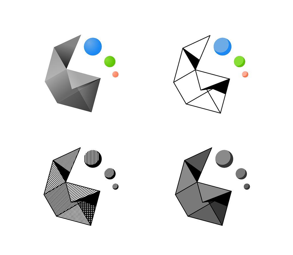
I guess Triangles. Most of them are too complicated but I guess they suit the KDE experience
The “thingy” looks like anal beads.
You’re welcome.
Anything is an anal bead, if you’re brave enough…
Dolphin crashes for me too currently, some KDEConnect problem
Not a fan
Thankfully we pretty much only see this at the start screen.
Triangles are the nicest
<img alt="" src="https://discuss-cdn.kde.org/uploads/default/optimized/2X/8/8a27749d1bc68d6ce5e824cc9d9393ed14a25de2_2_654x1000.png">
Actually, hexagons are the bestagons
Why is Grey not on Lemmy yet?
I’d probably go with fold or circles.
Trinagles are the worst cause there’s not really any ‘shape’ to them. It’s just a triangle with an image.
Triangles i think