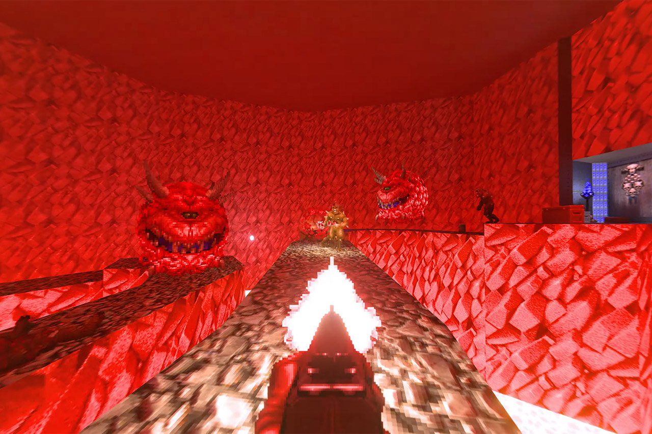
DOOM 2 Ray Traced Mod: Enhance Gameplay with Voxels
(www.retronews.com)
from jay@mbin.zerojay.com to retrogaming@lemmy.world on 14 Aug 2024 14:15
https://mbin.zerojay.com/m/retrogaming@lemmy.world/t/9824
from jay@mbin.zerojay.com to retrogaming@lemmy.world on 14 Aug 2024 14:15
https://mbin.zerojay.com/m/retrogaming@lemmy.world/t/9824
Discover the DOOM 2 Ray Traced Mod featuring full path tracing and voxel tech for an upgraded retro gaming experience.

threaded - newest
Really awesome work. Although I hope ambient light is adjustable. I feel like they went too far into showing off dynamic lighting by making everything very dark. E1M1 has a mix of dark and light sections that make it constantly fresh as you move through the level. The clips in the YouTube showed even the light parts of E1M1 have been made dark.
I want Doom with raytracing, not something that is artistically different.
The Doom engine didn’t have diffusing lights, only ambient light on a per-sector basis. Ray tracing doesn’t make sense in-engine unless you change how the lighting as a whole works.
In the OG engine, you can’t have a lit floor and a dark ceiling, for example. And objects in a dark area can’t be lit up by a light source from a bright area. The transition between lighting zones are hard cutoffs, and the maps were designed with this feature in mind.
If you want to add raytracing, you probably have to change the lighting from sector-based to source-based. That will inevitably change the vibe of some parts of the game.
Reminds me of a “Realism” mod for Minecraft.
Meh, I’ll play the original without melting my computer for no actual gains
Calling it a mod is a disservice, this is a customized GZDoom with a whole new renderer, plus the voxel sprites, plus lots of texture and map work to add reflections, lights, emissive textures, and more. It’s really impressive work! Sunlight streams in through skylights, looks slightly hazy, colored lights look great, buttons and screen textures glow. They even made the spectre have predator-style cloaking! There’s some cools settings too like being able to 50/50 split the screen with the default renderer so you can make your own “RTX enabled” memes and screenshots.
But yeah it definitely goes a little overboard. Turning off Bloom helps a lot, but I wish you could just turn it down. Even deactivated objects glow super bright, and things that light up when active all blow-out to pure white in the center. The map are way too dark generally though, to make the new lighting more dramatic but it’s bad. Also the metablob blood effects are funny and cute (woah, liquid blood that splatters and flows!) but it looks kind of terrible and very silly.
Still there’s some great surprises and gorgeous views! Definitely worth a spin!
Found a “Sewer count: 31” sign in the second level. Guess the devs are Civvie11 fans.