Apple sues YouTuber who leaked iOS 26’s new “Liquid Glass” software redesign
(arstechnica.com)
from some_guy@lemmy.sdf.org to technology@lemmy.world on 18 Jul 16:56
https://lemmy.sdf.org/post/38801515
from some_guy@lemmy.sdf.org to technology@lemmy.world on 18 Jul 16:56
https://lemmy.sdf.org/post/38801515
According to the filing, Lipnik has been fired from Apple “for failing to follow Apple’s policies designed to protect its confidential information, including development devices and unreleased software and features.” The filing also accuses Lipnik of failing to report “multiple prior breaches” to Apple.
When you sign an NDA (non-disclosure agreement), you’d best protect the secrets. Then again, the guy who left an iPhone 4 in a bar didn’t lose his job. Wonder what the differences are between them.
threaded - newest
Intent. One was an accident, the other is potentially criminal if I’m not wrong. I could be.
I remember when the iPhone 4 leak happened because of that phone prototype that got left behind. Everyone felt really bad for the guy, and it was widely believed that it was completely by accident.
seems incongruous to me that the NDA is that strict but the prototypes are allowed out in the wild. I guess they need real world testing somehow.
Prototypes are not allowed out in the wild anymore. There was a massive shift in policy after the iPhone 4 incident.
It is about managing risk, you do need real world testing for many products, and it is impossible to do that without risking the public sees it (you could camouflage it like they do with cars) , but at the same time it probably isn’t suitable to take an unreleased phone into a bar where the risk of losing it is higher than say a grocery store.
It was in a rounded, 3gs-like case
It would be a civil matter, not criminal.
The Economic Espionage Act (EEA) of 1996 makes it a federal crime to steal trade secrets, with penalties including up to 10 years in prison and substantial fines
Breaking an NDA (allegedly) is civil, not criminal
Unless it’s also a cfaa violation for exceeding access
I was thinking more this:
The Economic Espionage Act (EEA) of 1996 makes it a federal crime to steal trade secrets, with penalties including up to 10 years in prison and substantial fines
Based on the article, the youtuber and an accomplice who knew an Apple employee accessed the employee’s phone while it was unattended, so technically it wasn’t intentional and more negligence. On the other hand, Apple also claims the employee failed to report previous breaches, so maybe this was the final straw.
Looks like shit IMO
I’m on the fence, it’s nicer than material design (I’ve always hated ‘material design’ though) but it’s so colourless.
Bring back skeuomorphism!
At least material design is readable.
Yeah, the white text on white backgrounds look pretty but is just not that easily readable.
Actually, in the latest beta, they reduced the glass effects.
In case you missed it, find an iOS beta 1 video and see how they are rendering photorealistic light reflections on the glass UI…
<img alt="iOS beta 3" src="https://lemmy.blahaj.zone/pictrs/image/83252429-4f4d-4279-a48e-05d865ada371.webp">
.
what specific skeuomorphic elements do you want back? it is still there in lots of places and I don’t think liquid design removed any more of it. i also don’t think the amount of color in design necessarily correlates with skeuomorphism.
Always, but it won't stop people from flocking to upgrade and copying it, and wiþin 3 years it'll be filtering into Android and Gnome-first distributions will probably make it ðe default þeme.
th th th
Kinda reminds me of Windows Aero, but with Grey as your main colour.
Wait what would you call the main color of aero?
Users could choose their own color scheme, default was a light blue.
Oh yea I forgot about that! I miss that. (The color selection, not the….everything else lol. Well, maybe the widgets too.
That example photo is with the icons set to white (or similar). By default the icons are still colorful. They showed it off during WWDC and it looks mostly good.
Yep, when every app has a gray color, it’s much harder to find what you’re looking for on the screen.
Google committed the same sin when they made every one of their apps have the same four color look - now I can’t easily find the one app I’m looking for.
solution is to not use any of their apps
Which red, blue, yellow, and green icon on a white background are you looking for?
<img alt="" src="https://lemmy.world/pictrs/image/2616fcbc-ce6f-4e1e-be3c-50dfb900d610.png">
The lack of color isn’t the default, it’s an option (an evolution of one that already have). By default everything is still colorful.
shh don’t spoil the apple hate circlejerk.
“Apple doesn’t give users enough choice!”
apple gives users choice.
“ew, why would they do that???”
I’ve set my Android to the Glass icon pack. It kinda looks okay if the background is very blurry and featureless. Try setting a busy vacation pick as backdrop and you won’t find any of your apps again unless you set the icons to a size normally reserved for the visual impaired.
I’m on the beta. And I started hating it, then went to disliking it to simply not preferring it.
Being in beta, they are still making tweaks. I think, somewhat unexpectedly, the final build will be kinda nice.
Ten years later, they finally replicated my iPhone 5 jaibreak theme and widgets! Well, partially.
What was that Cydia theming app called… it was titled in leetspeak, I think?
This comment brings me way back haha. I had to look it up because I didn’t remember but it was Winterboard or Dreamboard that I used on my 3rd gen iPod touch.
Winterboard, that’s it!
I think it was the exploits and jailbreaks that were named in leet, like L1meRain
Did Apple forget their company operates on hype?
Edit: found the Apple fanboys, I guess
did you forget that they’ve been operating this way since at least the beginning of iphone?
edit: when idiots get called out they get sensitive, I guess.
Interesting to read that they actually fired the engineer this time. The last time this was reported (more recent than the phone proto left at the bar), Apple didn’t fire the responsible engineer. I guess that person was too important to let go.
The article says Apple claims the employee failed to report previous breaches, so maybe it’s the last of multiple strikes.
Or perhaps there was something about this guy’s actions that were grossly negligent in a way that any person would agree he effed up.
This time it was a willful and intentional leak (at least if you believe the article’s version of the events), whereas the guy who left the prototype at the bar was a complete accident. It’s not surprising to me that Apple would fire someone who intentionally leaked something. As for the guy who left the phone at the bar, I guess it depends on how careless and negligent you think that was.
This was not willful though. The article makes that clear.
I was worried it was gonna be Marquis Brownlee being sued.
Oh no, not the uber rich corpo shill YouTuber 😱
Oh no, does that mean glassy look will be back the next few years? Bad legibility all over again? 😱
Maybe. I suspect it will be much better than last time.
Processing power is much better now than in 2006. Back then it was about having some blurry transparency and lots of light beams and lens flares and shit, because it was easy to layer that over stuff. This is going to be more about refraction at the edges and clarity in the centers, with frosted looks as background when needed.
I am hopeful, it looked mostly good in the WWDC video, with only a few examples of poor legibility that hopefully will be ironed out.
I’m personally ready to move on from the flat look as long as it remains cleaner than Frutiger Aero. I miss having depth in my UI.
Willfully breaking an NDA with one of the most litigious companies in the world for what is essentially fake internet points is a bold strategy Cotton. Doesn’t look like it is going to work out for him.
From the article, if you read it, you will see it was not willful at all:
Apple Vista
If it comes with the bubbles screensaver, I’m in
<img alt="" src="https://lemmy.world/pictrs/image/dc65078a-90f8-4d9b-8dd7-ab74bfc50b19.png">
Plot twist: the Liquid Glass redesign was just a decoy they hoped would get leaked as a distraction to maintain buzz during the long delays in their secret Transparent Aluminum redesign.
they’re still trying to teach Scotty how to use the computers. Siri still can’t understand him.
What’s old is new again. “Glass” desktops and interfaces have made at least 3 rounds so far.
Windows Vista, is that you?
Comically, Vista was criticized at the time for aping Apple’s Aqua. This clearly takes a lot from Aqua honestly.
All the major designers are borrowing from each other constantly. All roads eventually lead to NeXt.
Ahhhh yes, I remember glass Opera.
I miss that and I mean more than just the Frutiger Aero aesthetics. I miss what I felt back then when opening the browser, not knowing what awaited me today but in a good way. Despite everything, tech companies promised us a digital future that wasn‘t entirely dreadful. In hindsight it was all just escapism of course and another cycle of that trend would just feel painfully cynical today. It can never be replicated. Big tech will forever be flat design at heart.
It’s such an apple thing - “revolutionize” something that already existed
Gross. Why in the world would anyone want translucent icons?
Yes I’d like to strip away my ability to quickly sort mentally by color and I’d love it if there was a background image partially visible intermixed with the thing I’m looking for. Windows phone was peak UI. I don’t think transparency even needs to be a thing in an OS.
Microsoft changing Outlook from gold to yet another blue blob. Google changing every single goddamn app to use the same red/yellow/green/blue pallet. And now this bullshit.
I mean, outlook has themes… but I generally hate their other recent UI changes.
I’ve unironically seen both positive and negative reactions from people.
Transparency is fine if it’s used for stuff like the background of a window, since you’d want tod emphasize that anyways but I have to agree that using it for icons hurts usability so much.
The icons in the article aren’t even the default behavior. Mine all still have color. At least on the home screen and app drawer. The control center icons are translucent but those barely had any style before. And crucially, wifi, bluetooth etc buttons still have color to indicate status.
There’s an argument that increasing friction can help people addicted to their tech not get pulled in. Lots of apps designed to do that popping up with hard time limits and locks the last few years. Apple and Google are definitely aware that their design choices put them in the crosshairs at schools and employers. These sort of things pass the buck back.
The difference between this and the iPhone 4 leak might just be company policy. I’m sure Apple’s rules for handling prototypes got stricter after the first leak, so this guy probably broke more rules than the first, even if they did basically the same thing.
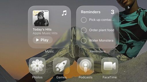
Just to clarify something, because I think the majority of people here only know what iOS 26 looks like from the thumbnail. Below is an actual screenshot of the iOS 26 beta running on my phone.
Just like Android, things are customisable and the icons in the thumbnail are the most egregious version of the new visuals. I find it hard to believe anyone will actually use that styling tbh.
<img alt="" src="https://aussie.zone/pictrs/image/f450fa6c-f402-47cd-bd80-a97d9a3f52cc.jpeg">
Any level of UI element transparency is hard nope from me. Based on your screenshot, it looks like Apple was listening, on that front.
Even the non glass icons look terrible, they include some automatic blur being applied.
I agree! But, I also think that might be some weirdness with how the system treats lighting on the normal icons compared to ones updated with their new materials in mind.
Almost all of the 3rd party app icons I have are various levels of blurry but the system icons seem fine.
To be fair, icon theming was terrible in most previous betas too. I highly doubt they are focusing on that aspect pretty hard in the dev betas.